Showing posts with label transportation. Show all posts

2013-05-15

Toronto Coach Terminal


Concept: 1 out of 5
Execution: 0 out of 5
Yeah, but: Like Opus said, "Well maybe not THAT bad, but Lord, it wasn't good."

The Long Version: The Toronto Coach Terminal, which is home to Greyhound, Megabus, and Ontario Northland, among other bus lines, is an excellent example of how not to do things.

First, the good points: Inside the main doors is a large ticketing area, as well as a traveller's information kiosk that's occasionally staffed by (presumably) friendly, patient, and helpful people. There's a considerable amount of seating, which is eclectically arranged and cosy, even though much of it is roped off as an 'express' area. There are information screens that show which platform each bus will be departing from, and there are even storage lockers available, which is quite a luxury these days.

And that concludes the summation of the good points of Toronto's Bay Street bus terminal.


It's not glamorous, but restrooms are one of the most important consideration for travellers. These are absurdly small and in terrible repair – if there was any doubt that this building is owned and run by the TTC, this will remove it. Accommodating four people will make the Men's uncomfortably crowded, and the Women's is rumoured to be worse. For bonus points they're in the basement, far away and out of sight of the bus platforms. The up and down escalators are in different places, so you don't return to where you started, and neither one is convenient to the bus loading platforms. I'm trying to imagine a worse implementation of such a fundamental amenity, and keep coming up blank.

Also downstairs is a small convenience store selling touristy things and a poolhall to help pass the time. There are no food-equipped vending machines in the building, though, so when those are closed it's time to explore the neighbourhood. The basement does have a pedestrian passageway to the Atrium On Bay shopping complex, which mostly keeps office hours, but has a food court with much better washrooms and a McDonalds. That seems to be the best we can offer visitors with two kids, three suitcases, and half an hour left before they need to go stand outside in a garage.

Yes, dear reader, the best is yet to come.


The bus platforms don't deserve the term. Civilized bus stations have indoor waiting areas with seats and heat, and the people walk up to the bus when it's ready for them. Toronto does it backwards. People here are expected to line up – at least half an hour early, because buying a ticket doesn't guarantee a seat – and stand waiting in an outdoor garage. Metal railings mark the places for the queues, but a bus that can hold fifty or eighty people can create quite the line.

Did I mention that this is in Toronto? There is a roof that keeps most of the rain and snow out, but our weather is lousy for most of the year, being either too hot or too cold. And even on a pleasant day, spending it standing squished between buses with their engines running is nobody's idea of fun.


When a bus wants to reach the loading area it needs to drive through the lines of queueing people, who now need to shuffle themselves and their luggage out of the way. Did I mention that these massive vehicles need to turn to reach the correct positions, often with just a few feet of clearance? I can't imagine the stress this must put on long-distance drivers as they try to navigate a moving obstacle course of tired people pulling toddlers and wheeled suitcases.

And the crowning glory of the whole endeavour is just how busy the whole thing is. I've been waiting at a platform for the suggested half-hour prior to departure only to have two other buses depart from the same platform in that time. This leaves the bus drivers walking up and down the line calling out their destination. "Peterborough? Peterborough? Niagara Falls? Owen Sound?" I think the term I'm looking for is 'cluster farce', but I could be mixing up two expressions.

And once the bus is ready to go the experience still isn't quite over. The buses get to pull out onto a nice and wide public roadway, but it's also used for bus parking, which narrows it considerably. Having your bus need to do a three-point-turn is just the crowning touch on a congested and absurd experience.


This station needs to be torn down. It can't handle the passenger volume, which is increasing, but its replacement hasn't been a priority for the city planners. GO Transit has a more sensibly designed station farther south to serve its regional buses, but there's no way to add on significantly more service there, and the main inter-city bus station really needs to be in the city's core.

The fact is that a city will make the room, and find the money, for the things that it wants. Improving the TTC-owned Toronto Coach Terminal just doesn't rank highly enough to happen. The commercial district that houses the existing bus station has had massive redevelopment over the past decade, including a huge parking and shopping complex on an ideally-located prime intersection. It should have been an automatic choice for a transportation hub, but even with that opportunity missed, other block-scale development projects are not hard to find.

I can only hope that our next mayor can see beyond the suburbs.


last updated 15 may 2013

2012-10-12

Buffalo Bus Station


Concept: 2 out of 5
Execution: 1 out of 5
Yeah, but: A bus station without amenities is a curb.

The Long Version: While I'm far from being a world traveller, I have developed a certain appreciation for bus stations. I've been through the one in Buffalo, New York, on several occasions, and I was recently lucky enough to spend four hours in it during the middle of the night. Writing a review seemed like the only sensible course of action.

Bus stations require certain amenities. First of all, there needs to be a comfortable place to wait. It needs adequate restrooms, some food options, and a place to buy traveller's necessities. All of this should be prominent and close to where the buses load and unload – ideally, within sight of the platforms. It needs to have good wayfinding and information, be clean and welcoming, and be kept in good repair. Buffalo actually manages to do much of this reasonably well, despite fundamentally being a bus station.


Buffalo's bus station – officially the Buffalo Metropolitan Transportation Center – seems to have been designed by someone who's really fond of international airports, because the seating is arranged in rows with enough space to stack weeks' worth of luggage between them. And the generous open space has no bearing on where the doors are for the bus platforms, which might have made sense, leaving the whole result oddly off-scale for the people within it.

With chairs set only the middle of the hall, Buffalo doesn't have any seating for people who prefer to have their backs to something solid. This might make it easy for the station's police to keep an eye on everyone, and discourage certain elements of local commerce from setting up shop, but it's a tough spot to be in. I wouldn't consider listening to music through my earphones in this layout – it would be far too easy for someone to come up to be from behind while I'm unaware. I hate surprises.

The bus platforms are signed according to carrier, but if you want to know where to wait for the Greyhound to Toronto or New York you'll need to ask the helpful attendant. And then the bus might still need to pull in somewhere else – such is life. At least the station designers realized that the weather in Buffalo isn't always pleasant, and the waiting area is indoors with double doors to keep the wind out. If only it was always like this.


Food options are a mixed success. Vending machines provide the most reliable service, and there's a change machine located in a completely different part of the building for people who don't have those archaic dollar bills. There's also a small take-out operation, quite literally a hole in the wall, that provides food that's not robust enough to be dispensed by robot. I didn't see hours posted for it; it was open past 3am when I was there most recently, although when I've passed through on other nights it has been closed. Finally, there's a small restaurant-like operation that's occasionally open – with different hours each day of the week – that I've never been lucky enough to experience.

There's nothing resembling a convenience store, magazine stand, or drug store for any other necessities. There are a few power outlets scattered around that people were able to use to recharge various devices, though, which is always nice to have. They're not conveniently located for travellers, having been intended for power-washers and floor polishers, but at least they aren't kept locked up.


The restrooms in the Buffalo station are another level of experience. Prominent and close to the platforms they solve two problems, and the mens' is able to accomodate quite the crowd if it needs to. But its barrier-free walk-in intentions must not have taken sight lines into account, because the entrance has been retrofitted with an oversized stall door. From the interior it blends into the wall of stainless steel doors, making it into a lobster trap for the tired, disorientated, or intoxicated.

To add to the ambiance, instead of having a sign marked "EXIT" this concealed door simply says "PULL". Yes, pull. It doesn't have two-way hinges, and being one of the few patrons to understand what the sinks were there for, getting through this door is not an appealing prospect. I'd hook it open with my boot, or hope for someone else to swing it open, and use my elbow to defend myself from it.


The bus station also houses the city transit bus, running under the NFTA banner. It took me a while to find out what that stands for: Niagara Frontier Transit Authority. I hadn't realized that Niagara is still a frontier, and haven't heard that term used to describe a civilized border in years, but I suppose it fits. Indeed, I did go from the pinnacle of Canadian urban sophistication to the American hinterland in less than two hours.

But the NFTA name struck me for a different reason. After all, this is Buffalo the City, named after Buffalo the Animal, which has a particularly brutal and genocidal history on the western frontier. I wouldn't expect them to want to remind people of that, but I've been wrong before.

Another interesting Buffalo experience was to have an armed agent of the government approach me and ask to see my papers. Politely, of course, and when I said that I was returning to Canada he lost interest, but this has happened before when I travel by bus, and I always take offense. It seems a little odd that these blanket stop-and-question episodes don't raise the hackles of the live-free-or-die crowd, but I have to wonder how much of a difference it makes that it's immigration enforcement doing the work. Another happy thought.


Being a border town, Buffalo sees a fair bit of traffic as a waypoint, but not much use as a terminal. That's a bit of a pity, because the station is well-situated in downtown Buffalo, and that's an area that could really blossom with more tourist and commercial activity.

A bus station without amenities is called a curb. The Buffalo station is functional if unwelcoming, capable of handing high volumes of stopover passengers but without the deeper considerations that would make long layovers more bearable. Long-distance bus travel is always an arduous task, and the stations need to be very durable, making this a very tough bit of architecture to succeed at. Buffalo isn't as good as Chicago, Syracuse, or New York; I'd say that it's about on par with Detroit. But it's vastly better than the Toronto Coach Terminal, which happens to be my home station.


last updated 12 oct 2012

2012-05-19

Victoria Park Subway Station


Concept: 4 out of 5
Execution: 4 out of 5
Yeah, but: Second time's a charm.

The Long Version: Subway stations on the Bloor-Danforth line are usually a 3:1 ratio of utility to ugly, but for the old Victoria Park station the numbers were reversed. It used an odd layout with an elevated train track and bus bays on the same level; these bays were reached with a pair of up/down staircases after walking through a long interior concourse. The pedestrian options were either an automated turnstile and long narrow hallway that ended in the commuter parking lot, or a strange main exit out of the side of the building, which faced someone else's parking lot. For bonus points, there was an impromptu passenger pick-up and garbage-storage area underneath the subway bridge. Welcome to Scarborough.


But that was years ago: recent renovations have vastly improved the station. Large windows were knocked into the walls on the platform level; sometimes the results are awkward, but it does open up the station to its surroundings. The bus bays have been moved to the ground level, and there's a long glass wall that lets people wait indoors. The station has been designed with contemporary ideas about accessibility and comfort, and it's a profound change.

The station's main entrance now faces the street, with glass replacing the concrete facade. A secure, enclosed and reasonably-priced bike storage area fills most of the void under the bridge, but still allows for an open sidewalk. It's a huge improvement, inside and out.


Not all is perfect with the new layout, of course; if nothing else, the lone transfer-issuing machine is oddly hidden. But after spending half an hour there on a weekday morning, I found myself thinking that it's too bad that the station is tucked a short distance north of the Danforth, which is the main commercial street with a fair bit happening on it. The revitalized station could easily become the gateway to a community that would really benefit from a little more exposure.


Victoria Park station used to be a bunker, squatting in a high-rise community that already had far too many concrete walls. The renovations haven't quite made it into a cathedral, and it's still not actually attractive, but after being used to the oppressiveness of the old station – and all of the others designed in the Stalinist Public Washroom period of TTC architecture – it's an astonishing change. My biggest challenge in taking these photos was having too much light and too many windows. In a subway station. Owned by the TTC. Amazing.

It's been made perfectly clear to everyone in Toronto that the TTC doesn't have any spare money. But I'm glad that they found the cash to revamp Vic Park, and they've done a great job with it – which is quite something for a downtown-dweller to say about his former near-suburb neighbourhood.


last updated 4 dec 2010

2011-12-30

"Toronto Rocket" LED Subway Maps


Concept: 3 out of 5
Execution: 1 out of 5
Yeah, but: Just look at how shiny it is!

The Long Version: Toronto has been working hard on its transit system recently. Just this year the city has decided that transit is so essential that the workers who run it lost their right to strike, but not so essential that the system should actually be properly funded or given priority in transportation planning. As always, politics involves compromise.

As a way of squeezing more capacity out of a constrained system, the Toronto Transit Commission has been introducing new subways to its busiest line. Enthusiastically called the Toronto Rocket, these Canadian-made cars offer significant improvements over the previous Canadian-made models. In addition to more standing capacity and wider doors, they've tinted all of the glass so that passengers aren't distracted by being able to see what station they're in. The new subways also introduce some cutting-edge 90's technology, like computerized voice announcements, pixel boards, and LED lights in the system maps.


The LED maps use green and reddish-orange lights to indicate the stops. The upcoming stop flashes, and the 'interchange stops' – a term that, as far as I know, isn't used anywhere else by the TTC – are marked by larger lights that are always orange. In our "green means go" society, where red is used to mark hazards, it's natural and intuitive that the train has passed the orange lights and the green ones mark future destinations. However, since this is the TTC, that's the exact oposite of what the colours mean.

The TTC hasn't called a coin toss correctly in years.

One nice thing that the new "Rocket" trains have is indicators showing which doors to use at the next stop. Toronto mixes island with side platform stations, so this is good to know. This could also be shown on the system maps by replacing the station-marking dot with a bold dash. Oriented along the subway line, it shows an island platform, but drawn across the line it would represent side platforms. They could even add a subtle break in the dash at Dundas to show that it's the only station where it's not possible to change from one platform to the other.

If they were inventive, they could even make it light up.


photos updated 9 jan 2012

2011-07-27

Xootr Swift: Two Years Later


Concept: 5 out of 5
Execution: 5 out of 5
Yeah, but: Little wheels even make it easier to open doors.

The Long Version: Two years ago I wrote about the Xootr Swift folding bike, and it remains one of the most popular reviews on this website. Now it's time for a follow-up.

First, a quick recap for those who arrived here directly, and don't want to wade through the original report: the Swift is an apartment-friendly design from New York City that has a simple and strong fold, but at the expense of being larger than just about any folding bike when it's compacted down. Rather than following the British model of a bike that will fit under a seat on the tube, this is a quintessentially American bike that will fit in the boot – trunk – of a mid-sized car.


The Swift folds vertically, being split on the seat tube and locked in place by two quick-releases that clamp the seat post in place. It's an exceptional use of the inherent strength of these components, and is both visually and mechanically elegant. The bike comfortably fits sideways in a storage room that's barely wider than its own doorway.

Normally the seat post will lock the bike tightly into its folded position, but my Crossrack stops it from dropping far enough down. Instead I just secure the seat tube to the top tube with a reflective ankle strap, which is actually the only time that I need one of those ultra-fashionable accessories. Small wheels mean that the Swift has an unusually large front chain ring, putting the chain too high to snag the cuff of my jeans or my shoelaces, and it even has a built-in guard for good measure. That's a huge win for the Swift.


A few things have changed compared to when the bike was new. While the stock brakes on the Swift are decent, I've upgraded to Shimano Deore levers and V-brakes for a significant improvement in stopping power. There's less flex in the system now, making the whole thing crisper and giving me more confidence on the road. Changing the brakes over was easy, and the standard-length cables that the kit came with were ample.

I've also swapped out the stock pedals for bigger platforms. I bike wearing soft shoes – inefficient but practical – and these BMX-style pedals are more comfortable and, to my eye, look better. They're nothing fancy, being about the cheapest ones that MEC sells, but if I was looking for ways to drop weight and improve performance my bike wouldn't be the one with the most work to do.

Other minor positioning and accessory refinements mean that the bike suits me even better now than it did when it was brand new. But the biggest change is that I've replaced the stock Kenda Swift tires with Schwalbe Big Apples. These tires are relatively famous, and really change the personality of the bike. I've split off my experience with them into a separate review here.


During the riding season my Swift stays out on the balcony, and I have to admit that I don't pamper it. Two years have left rust on the bolt of the quick release that holds the handlebar riser in place, as well as faint hints of rust on the riser itself. The chain shows some rust, as chains will do, but the other quick releases are clean. There was also some rust on the curved brake cable guides, the part right above the brakes themselves, but those are gone now.

Aside from that there are a few more nicks and scratches on the frame, and the half-grip on the right side of the handlebar needs to be snugged back into place occasionally. I could just fix that with some cheap hairspray, but now I keep it in place with a bar-end bell instead. And that's it – aside from those very minor instances of wear-and-tear, the bike is just as solid as it was when it was brand new. There's no new wiggle, no extra flex, no movement in the frame pivot and no creaks or rattles.


I fell in love with the Swift as soon as I took it out on the streets, and I'm still just as happy with it after these two years. Last summer I had a delusional episode and considered switching to skinny tires and clip-on bars, because I have no doubt that some lighter components could make the Swift into a respectable racer. I'm nowhere near fit or dedicated enough to pull that off, but it's nice to know that it's possible. For the bike, at least. As for me, I'm perfectly happy with having a tough and versatile commuter bike that I can have some fun with on the weekends.

After two years I still have to give the Swift a perfect score, which is something I almost never do. In a world of compromises and design decisions, I really can't see how Xootr could have made a better bike for less money. The usual caveat of making sure that it's the right choice for the purpose remains: it's a small-wheeled bike that folds down a little, instead of being a cubic foot of components that latch together into something ridable. But aside from that, I'd recommend the Swift for anyone who's looking for a folder, or even for anyone who just wants a great all-purpose urban bike. I'm looking forward to many more happy years with mine.


last updated 27 july 2011

2011-07-23

Schwalbe Big Apple tires on a Xootr Swift


Concept: 3 out of 5
Execution: 4 out of 5
Yeah, but: Make sure they fit.

The Long Version: If the way to a man's heart is through his stomach, then the way to a bike's personality is through its sneakers. The stock Xootr Swift comes with a set of Kenda Kwest tires that are good all-around performers, which makes for a sprightly bike that's comfortable to ride. Narrower tires that run at a higher pressure will make the Swift into a little racer, while bigger tires have a tremendous ability to absorb bumps. Schwalbe's Big Apple tires are definitely in the second category. I put them on my bike a month ago, and the difference is amazing. I'm just disappointed that nobody else noticed how it makes the Swift look much tougher.

Having the big Big Apples on my bike has slowed it down; conversely, it makes me work harder to go not-quite-as-fast. But on hard-packed trails and bad pavement the difference is huge: much better shock absorption and a general sense of sure-footedness that I didn't have with the skinnier tires. It's also more stable when rolling at slow speeds, letting me stay on the bike and in control when other cyclists are putting their feet down. I don't know if that's because of their width or their not inconsiderable weight, but they're almost as good as doing a track-stand without the need for all of that pesky balancing.


The Big Apple tires for the Xootr Swift are 2" across, which is considerably bigger than the 1.5" of the stock Kwests. The front fork has no problem with the added size, but not all Swifts are going to be happy with something this big in the rear. Mine has taken some coaxing to make it work properly, but fortunately the horizontal dropouts let the entire rear wheel move back a half-inch or so. That has given me the extra clearance that I need, even though it hasn't made the derailleur all that happy. Buy the Big Apple through a dealer with a good return policy, and make sure you try it on the back of the Swift before opening both packages.

The other consideration with the Big Apples is that they should use different inner tubes from the ones that came with the bike. I have to admit that I managed to irreparably puncture one of my new bigger tubes during installation, so the front wheel is using the undersized original one with no ill effects. I inflate the rear tire to its maximum of 70psi, but leave the front at 60psi or so. When I eventually replace the tube with the proper size I may increase the pressure, but its current setup gives better shock absorption. After all, I didn't pick these tires for their speed.

Finally, I really like that the Big Apples have reflective rings on their sidewalls. It's almost as if Schwalbe knew that they were going to be put on a bike – a nice touch and a good design.

A little update: it's been over six months since I put the Big Apples on my Swift, and I remain completely happy with them. I'm not usually a winter cyclist, but I have biked through a snow storm with these tires. I deflated them somewhat – still well within their generous pressure range – and took it easy when I was playing in traffic, but I just tend to be cautious when drivers aren't expecting bikes to be out. Yes, I did lock up my back wheel once, which is pretty minor, but I couldn't break traction by accelerating no matter how hard I cranked. Not that I'm particularly strong, but it was still enough to impress me.


last updated 11 feb 2012

2011-06-12

The Generic Folding Hand Truck


Concept: 4 out of 5
Execution: 3 out of 5
Yeah, but: Perhaps they're not all the same.

The Long Version: Back when I was sixteen years old, a friend of mine told me that I combine great ideas with lousy timing. Twenty years later, he's still absolutely right. Last fall I hand-carried a forty-pound printer for a kilometer before it occurred to me that I could really use one of those folding hand trucks. Great idea, lousy timing.


These little hand trucks are pretty much a generic product. I bought mine from Canadian Tire, but they're also available through the toy store Uline and at least a dozen other places. (1, 2, 3, 4, 5, 6, 7, 8, 9, 10, 11, 12 ) The prices and details vary, but they're typically rated for between one and two hundred pounds, and weigh about twelve to twenty. The wheels pivot out when the load platform is lowered, and while the wheels have some positive camber, the weight on the cart keeps them in place. It's an elegant little system, and when combined with the telescoping handle, the whole cart takes up very little space when it's not needed.


The typical hand truck with a short bed is good for tucking under a stack of heavy boxes, and is great for running things on and off of a moving truck – quickly shuttling boxes that are already stacked. These folding trucks have much larger platforms, meaning that they're at their best when the load is assembled directly on the hand truck. That's perfect for household use, and I've seen a number of independent couriers using them when they need to zip around quickly in little runabout vans. It's a real advantage when they can carry a couple of stacks of light boxes that wouldn't stay put on the typical design.


A big empty hand truck is nothing but a hassle, so it's fantastic to be able to carry this little cart folded up until I need it. I do also own one of those generic black plastic hand trucks that can be converted into a flatbed dolly, and when it's time to haul a couple hundred pounds, that's what I reach for. (Actually, it's what I dig out from the far end of the storage room.) But for a half-dozen little jobs, from shopping for a small potted Christmas tree to taking the 40lbs propane tanks to be refilled, the folding truck has been perfect. I've put a hundred and twenty pounds on mine and then walked it a city block without a single worry. And when I'm back home, it folds up and hangs on the wall where it's in easy reach for the next time.

Sometimes I marvel at my little folding hand truck, and wonder what I would do without it – but the answer to that is simple. If I didn't have it, I'd go out and buy one.


last updated 12 june 2011

2011-04-12

Transit Maps of the World, by Mark Ovenden


Concept: 3 out of 5
Execution: 3 out of 5
Yeah, but: Transit pr0n is an unusual sub-genre.

The Long Version: Transit Maps of the World isn't a book with a gripping narrative that you'll want to read from cover to cover in one sitting, but it's an interesting collection of information just the same. As the name implies, it compiles almost 200 different subway systems. I can't confirm that it includes every system in the world, but it sure is an awful lot of them.

The book is divided into sections. The introduction provides an overview on the general evolution of mass-transit rail, and the way those systems have been depicted as maps evolved into diagrams. From there it delves into specific systems, which are split into token groupings based on the age and complexity of the systems. The grand networks, such as Berlin, London, and New York, are all covered extensively. Smaller and newer networks receive proportionate attention: Hong Kong and Mexico city get two pages each; Toronto and Los Angeles get one page each; upstart and little light-rail surface networks are grouped in the back with just a paragraph to describe the system and its accompanying map.


It should go without saying that this is a book about the transit maps that each system has generated, and while that unavoidably includes some information on the history and contemporary operation of the different networks, the focus remains on the design and implementation of its wayfinding. A certain amount of repetition is unavoidable – similarity among the designs indicates their broad success – which makes this a great book to pick up, get involved in, and then put down until next time.

Transit Maps of the World becomes a launching point. It, and a couple of trips to New York City, have completely rewritten my understanding of Toronto's own two-and-two-halfs subway network. It's led me to spend several happy afternoons learning more about different subway systems (check Joseph Brennan's awesome list of abandoned subway stations in NYC) instead of getting actual work done, and I've even started a little personal project to play with some ideas for Toronto's subway map as well.


Part of planning a recent trip to New York City involved finding the best subway station to get to from the place where the bus would drop me off. I was looking at the very geographic MTA map, but when I shifted to Google's view of the city I discovered that the actual distances were different enough to make me choose a better route. Subway maps invariably distort geography, but instead of being a flaw, it may simply reflect the different spatial relationships within the city that mass transit creates.

There's a big difference between a map and a diagram. Depicting a transit network balances the complexities of presenting information in a way that's simplified enough to be comprehensible, but accurate enough to be useful. How that problem has been solved around the world and over the past century is ultimately what Transit Maps of the World is all about.


last updated 12 apr 2011

2010-11-14

Porter Airlines, from Toronto Island Airport


Concept: 3 out of 5
Execution: 5 out of 5
Yeah, but: How often do you rave about an airport?

The Long Version: I don't mind flying, but I dislike airports, and Toronto's Pearson International deserves a special mention as an abysmal place to spend time. It's crowded, poorly run, and inconveniently located in Mississauga. It's so bad that it's even worse than other airports, and that's really saying something.

But it's a little-known fact that Toronto has an airport located right downtown - its existence has certainly come as a shock to all of the people who have bought condos on the waterfront. There's just one single airline operating from it right now, but when it came time to book a flight to New York City, flying Porter out of Toronto's Island Airport was a natural choice.


Porter is a small airline that mostly targets short-hop business travel, flying 70-seat Bombardier Dash 8 turboprops. This is a different experience from a big jet, and it all comes down to working on a smaller scale. These little planes make money even when they're half empty, so instead of crushing through security and customs with hundreds of vacationers, imagine travelling with a small group of business-people that could easily fit in a nice motorcoach. The only downside that I found was that the ride was a little bumpier than on a jumbo-jet flying ten thousand feet higher; the cabin noise was a higher pitch, but not as loud as the normal jet roar. The flight from Toronto to New York is long enough to take off, eat the world's smallest box lunch, and land. Even if that was the entire experience, there's no question I'd be flying with them again. But it gets even better than that.


Because of political opposition to the long-running existence of the island airport, the experience starts with a 400-foot ferry ride across the Western Gap. The single ferryboat runs every fifteen minutes, and Porter has a check-in counter in the mainland terminal that can occupy some of the waiting time. Once on the island, there's an enclosed walkway to the main terminal building, and getting to the gates involves the minimum amount of hassle that's allowed by law. Instead of arriving three hours early for US-bound flights leaving from Pearson Airport, Porter recommends reaching them just one hour before the flight takes off. Travellers clear US Customs and Immigration once they arrive, but the time I saved by not having to drag out to the suburbs and then stand in line until it's my turn to be rushed to the front of the queue so that I can just barely catch my flight is immense. Even if that was the only benefit of going through the island airport, I'd do everything I can to never see the inside of Pearson International again. But it gets even better than that.


Just past the final escalator into the waiting area there's a decent-sized kitchen area with a drink fridge, snacks, and stations for making coffee or tea. I looked around for someone to pay, expecting a trap, but it's all complimentary. I can't think of the last time I was surprised by not having to pay for something relating to air travel. I may still have a packet of almonds to show for it, as well.


Off to one side of the terminal's lounge is a business centre with better than a dozen iMac computers. A waiting area that looks like the lobby of a nice hotel, free computer time, free internet access, free cans of coke - in an airport terminal.

Commercial air travel is one of those things that as been getting worse every year, and that's been the case for a very long time. It's nice to have an airline that has reset the clock and brought in a high-end service that doesn't cost any more than a comparable flight from one of the lousy airlines flying from an expensive and nasty terminal. From now on, if I have a choice, I'll be taking Porter from the Toronto Island Airport, even if I have to change my itinerary to do it. There's simply no comparison.

If there's one thing Porter loves, it's emailed discount codes. Unless otherwise noted, each code is for 30% off:

ART30 – book by 6 apr 2011, travel apr 15 - sept 6 2011
SWEET30 – book by 20 apr 2011, travel may 1 - sept 6 2011
DRUM – book by 4 may 2011, travel may 12 - sept 6 2011
SIZZLE – book by 18 may, travel may 27 - dec 15 2011
CIRCUS – book by june 1, travel june 9 - dec 15


last updated 28 apr 2011

2010-03-27

TTC Token Holder


Concept: 3 out of 5
Execution: 2 out of 5
Yeah, but: I'm going to take a pill.


The Long Version: For the past eighteen months, I've been using a keychain pill container to carry my TTC tokens. In a comment to that review, someone told me where to go to find the purpose-built token holder. It's a flat piece of slightly flexible plastic with grooves to hold tokens along both sides of it. It uses a friction fit, and can hold five on each side, for a total of ten tokens at its maximum capacity. Bought for $1.50 from the Gateway News at Bloor station, it's possibly the cheapest thing I've ever reviewed.


I've been using the token holder for two weeks, and while I like some aspects of it, I'm going back to my pill container now that this review's been written. On the positive side, I've really liked being able to slide a token out with one hand, and not having to take it out of my jacket pocket to do it. It's faster than the threaded pill container, and is less likely to devolve into a comedy routine if it gets dropped. It's a slim design that's easy to carry, and it isn't going to break anyone's budget.


I really only have two quibbles with the design. One is that it only holds ten tokens, and the two that are in the fifth position are barely gripped by the plastic edges. While they're surprisingly hard to dislodge, it is possible and has happened to me during my trial period. An easy design change - lengthening the gripper edges - would solve the problem, but the economics of needing new tooling means it will probably never happen. As it is, I wouldn't use the handy little loop on the end of it to attach it to my keychain. It can fit in my wallet, which keeps it secure, but it adds a lot of bulk and defeats the convenience of having it accessible. That leaves carrying it loose in a pocket or in my bag du jour, but I have enough challenges keeping track of things already.


My second quibble is that it only holds ten tokens, and they're sold in either batches of ten at the collector booths, or in eights at the vending machines. That puts a crimp in how often and when I can buy tokens; I prefer to stock up rather than waiting until I'm desperate. Since I only take the TTC when I've run out of other options - seven or eight times a week - that hasn't made my commute any easier. My repurposed pill container can carry nineteen tokens comfortably, and will take a twentieth in a pinch, which makes it simple to buy more whenever I have enough cash on hand.


The purpose-designed holder is cheaper than the pill container, and I can see how some people might prefer it, but I don't. Maybe I'll keep mine stashed with a small emergency token supply, or maybe I'll give it away as a prize in a contest. Life is full of options, which is always a good thing.


2010-03-17

2009 Toyota Prius


Concept: 4 out of 5
Execution: 4 out of 5
Yeah, but: It just runs and runs and runs...


The Long Version: The recent press notwithstanding, the Toyota Prius is one of the best hybrid automobiles on the road today. This is my review of the 2009 Toyota Prius after 11 months and 18,000 miles.

2009 was the last year that the second generation Prius was manufactured. I got my copy in April 2009 due to the convergence of a number of circumstances; the local economy was pretty bad, which meant that the local Toyota dealership had unsold Prius' sitting on their lot, and the 2010 model had been announced, further depressing sales of existing 2009s. Finally, we'd walked onto the Toyota lot after a less-than-satisfactory experience trying to purchase a Honda 2010 Insight.

The wife and I were in the market to purchase a high-efficiency vehicle for me to use as a commuter car. I drive around 55 miles round trip to work during the week. Before the Prius I was driving a 2003 Kia Sorento. When I bought that car in 2002 gas was going for 88 cents/gallon. That price rose drastically over the years, through the 2004 and 2005 price shocks due to hurricanes, topped by the 2008 price shock due to the speculative bubble in the commodities markets. By mid-2008 gas in Orlando reach $4.14/gallon. It took between 19 and 20 gallons/week to fill the thirsty Sorento, so at gasoline's peak price I was spending $80/week to fill the car, or $320/month. Add to that the cost of gas for my wife's van and my two girl's cars, and I was spending $600/month for gas for the entire family.

We'd been looking at the Prius long before the 2008 gas spike. We'd been reading about the Prius' high gas mileage and excellent quality for years in the pages of Consumer Reports (CR), where CR has consistently rated the Prius as Recommended year in, year out. Before we bought in 2009 we'd gone to look at earlier models, and take them out for a drive. But we'd look at the family finances and come to the conclusion "not yet." But with what we went through from 2004 to 2008, we were more than ready. We just needed the right deal, and that came our way in April 2009.

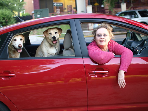
From a practical standpoint the Prius is big and roomy on the inside. It's more than comfortable for four adults (like myself, my wife riding shotgun and my two adult daughters in the back). With the rear seats folded down it has a lot of rear cargo space, more than enough for two Labs, a week's worth of luggage for the wife and I (Labs don't need much, just their sleeping mats, their retractable leads, and puppy chow), and my Olympus camera gear. It's a great little touring car especially for tooling around Florida.


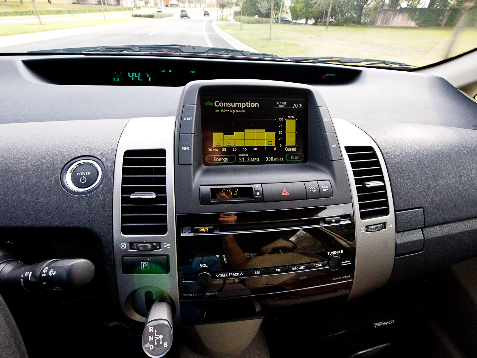
Gas mileage is great in my Prius, higher than the published 48 mpg highway/45 mpg city/46 mpg combined. With my driving I get 50 or more combined mpg. This value is on dry pavement in reasonable weather. When it's wet (summer rainy season) or if it's very windy (winter dry season) the combined mpg drops down to around 47. But that's still higher than published specs.


What makes it easy to hit higher-than-published mpg values is the center console that came on our model. The center console is a color LCD screen. It performs a number of tasks, such as showing instantaneous and average MPG (Consumption), how the electric and gas motors are operating with the battery (Energy), setting the air conditioning (Climate), picking your radio station (Audio), and showing a live-view of the back of the vehicle when placed in reverse. When not in reverse, the display defaults to Consumption.

If you pay attention to the Consumption display out of the corner of your eye, you start to drive like you play video games; you try to operate the vehicle to get the highest score (mpg) without earning the undying wrath of your fellow drivers. I'm no hypermiler, but I've learned not to bolt off the starting line after a stop, to slowly and evenly come up to speed, to coast whenever possible and as soon as possible, and to drive at or below the speed limit. I drive the speed limit on the side roads and city streets, while I keep the highway speeds at 65 or lower. 65 mph isn't the best highway speed (60 is), but anything over 65 leads to a 45mpg (or lower). All of this helps me hit my target mpg of 50. More than 50 is icing on the cake.

Earlier I wrote that during the gas spike of 2008, when gas was over $4/gallon, I was spending $80/week to fill my Sorento. With gas hovering near $3/gallon right now, I'm spending $80/month to keep the Prius filled, or what it cost to fill the Sorento in 2002. Yes, I've got a monthly car note I need to service, but a goodly chunk of that is being offset by the gas I'm not having to buy.

While most associate speed with noise, the Prius is unusually quiet, even when it's going very fast. Just how fast? Fast enough, quickly enough, quietly enough to land you into trouble if you're not paying attention to the posted speed limit. As a consequence I've developed the automatic habit of using cruise control, even on side roads and long stretches of city streets between stops.


My Prius is red, and statistics show that police love to ticket speeding red autos more than just about any other. I might as well paint signs on mine saying "Catch me, please." Remember, kids, cruise control is the most important feature of the car.

Would I buy another Prius? You bet I would. I've owned many brands over the years, and in spite of the current rash of trouble that has rained down on Toyota over sticking accelerators, I'm here to assure you that I'd rather have the worst of Toyota over many other manufacturer's best. The Prius has proven that it's safe, reliable, and a distinct pleasure to drive. The Prius may not be the cheapest, the biggest, the fastest, or the sexiest to drive, but with the right handling and the right attitude the Prius is the best overall automotive investment you can make right now. And as gas prices in central Florida continue their slow inexorable rise to $3/gallon and higher, my April 2009 investment is making better and better sense every day.

Camera equipment used
Top photo: Olympus E-3, 12-60mm SWD
Second photo: Olympus E-3, Sigma 30mm f/1.4
Third photo: Olympus E-P2, 9-18mm w/MMF-1
Forth photo: Olympus E-3, 12-60mm SWD

2010-01-20

Greyhound


Concept: 3 out of 5
Execution: 3 out of 5
Yeah, but: YMMV.

The Long Version: I want to call them Greyhound Bus Lines, but like Bono, Cher, and Liberace, they seem to be going by only one name these days. So just to be clear, this is a review of the transportation company, not the dogs. I like the dogs, and may have one someday, but for now I'm just looking at the buses.

One of the most amazing things is that Greyhound goes almost everywhere. The idea of the photographer's road trips appeals to me, and since I'm not much of a driver, I need to find other transportation. The train hardly goes anywhere useful, and flying is far too much hassle to do for fun. And in the spirit that the journey is part of the trip, instead of an inconvenience to fast-forward through, there's something very earthy about getting there by bus. And Greyhound is synonymous with buses in a very fundamental way. So when a city or town piques my interest, Greyhound's tickets page is the first place I look. I know that I can get from Toronto to Moncton, New Brunswick, in about a day with four transfers. That's where my Nikon F100 lived before I adopted it. A day is also enough to get me to Roanoake, Virgina, which is mentioned in a catchy song (@3:02). Even if I never go to any of these places, it's nice to know that I can. I could leave tonight and be in Kalamazoo, Michigan, for lunch. How cool is that?


Yes, the world is full of potential, but the reality is a bit different. The seats are small and inevitably become uncomfortable: there's a reason why airlines call their cheapest, most confining seats 'coach' class. The window seat's claustrophobic and the aisle means being bumped and having nowhere to lean. Unlike a train, getting up to walk and stretch isn't a realistic option, and the rest-stop bathrooms start to seem like a blessing. Unlike a plane, the three hours you'd spend being scanned, poked, and waiting in rows are spent swaying from side to side. Okay, so maybe that's not a bad thing, but my point is that a full bus can feel like a holding cell and sound like a high-school cafeteria.

Even the comparatively short six-hour jaunt to Ottawa is something that I'm only thinking of fondly now that time has dulled the actual experience of feeling uncomfortable, crowded, restless, and bored. I haven't had this level of self-imposed experiential revisionism since I saw the movie Magnolia, and for much the same reason. It's been a decade, and now I think I actually liked Tom Cruise in it, and I'd be okay with renting it some time. Ottawa was two months ago, so maybe I'll do Chicago in the spring.


My longest trip was a one-way from Omaha, Nebraska, to Toronto. It was over thirty hours, but I was exhausted and slept most of the way. I took some photos at one of the transfer points, and always need to dig up my old itinerary sheet to see what city I was in. A blur, to say the least. I was invariably in a window seat, and usually had the pair to myself, but occasionally I'd wake up to find someone new sitting with me. Later they'd be gone, and I wouldn't remember them leaving. I do remember that the Omaha bus terminal was right next to the jail, and it seemed like most of the dodgiest individuals in the station were taking the same bus that I was. Someone once compared taking a train into a city as being like entering a house through the basement: you see all the industrial, utility, and storage areas instead of the presentable facade. Bus stations can take that and throw in some elements of a backpacker's convention as well.


A more practical and common Greyhound trip for me is short intercity hops to visit family; two round-trips aren't any more expensive than renting a car for a day, and there's less time pressure. The stations that are downtown are a real plus for me, despite my Nebraska experience, since it's where I live and it's where I want to be when I visit. There's no hassle with luggage, and I know it's handled reasonably well even if there aren't any claim tickets when it's pulled out at its destination. Pretty much everyone there is on the road for functional and practical reasons, and problems are very rare. Despite all of the negatives, it's still a cheap and interesting way to travel. If I have enough time to get there on the ground then I'd rather not fly; if there's no train then I'm happy enough to take the bus.

But I reserve the right to update this review when I get back from Chicago.


2009-12-20

Xootr Crossrack


Concept: 4 out of 5
Execution: 3 out of 5
Yeah, but: Perhaps I need more trust.


The Long Version: The crossrack is the only pannier I've seen with this design: it only attaches to the seat post, but holds a regular pannier instead of a rack-top bag. This is a fantastic idea, since panniers are easy to find in a variety of styles and styles. Rack-top bags are much more limited, and typically only range from small to not-very-large. The crossrack also puts the load vertically, closer to the centre of gravity for the bike, while the rack-top styles are long unsupported beam that stick out into space. I wonder why the crossrack didn't happen sooner.


I've put a pannier from Mountain Equipment Co-op on mine; it attaches with a zip-off panel that hides backpack straps. The crossrack is adjustable, and I've angled mine so that it's canted slightly forward, thinking that it would put less stress on the attachment points on the pannier. Xootr's page shows it tipped the other way, which will let the rack and bag be mounted on bikes with less space between the rear wheel and seat. The Xootr Swift, as a 20" wheeled bike, is quite generous in this respect. I'd be hesitant to put it on a bike with big wheels and a small frame, but for larger vehicles, it should be great.


The crossrack is rated for 25 pounds. It's a two-piece design that's joined with a pin, so I do hesitate a teeny tiny bit when I add too much weight. The counter benefit is that it makes it easy to pull the rack off of the bike when it's squeezed into a narrow space for storage. Unfortunately, leaving the clamp on the seatpost means that it can't drop down and lock the Swift in its folded position. That huge dilemma was solved with one of my many reflector-and-velcro ankle bands, several of which I carry in my pannier for no particular reason. Other than that, I have no complaints. The bag carries everything I need, and it being on the centreline of the bike means that it's protected if I fall over. Having no rack below it means that my camera-du-jour isn't bouncing off of a solid platform all of the time. Even if I had a standard bike that could take a standard rack, I'd still choose the crossrack for small loads and day-to-day use.


contact me...

You can click here for Matthew's e-mail address.